
Since 2016, I’ve been sharing my work, writing and drawing about making things, yourself and the future. You can find my most recent work in my newsletter, Illuminating Letters.
These are a few of my favourite posts from the last little while, but feel free to rummage through the archive too.
Making magic
Composed upon Westminster Bridge
Thanks! It has pockets!
I might be overthinking this
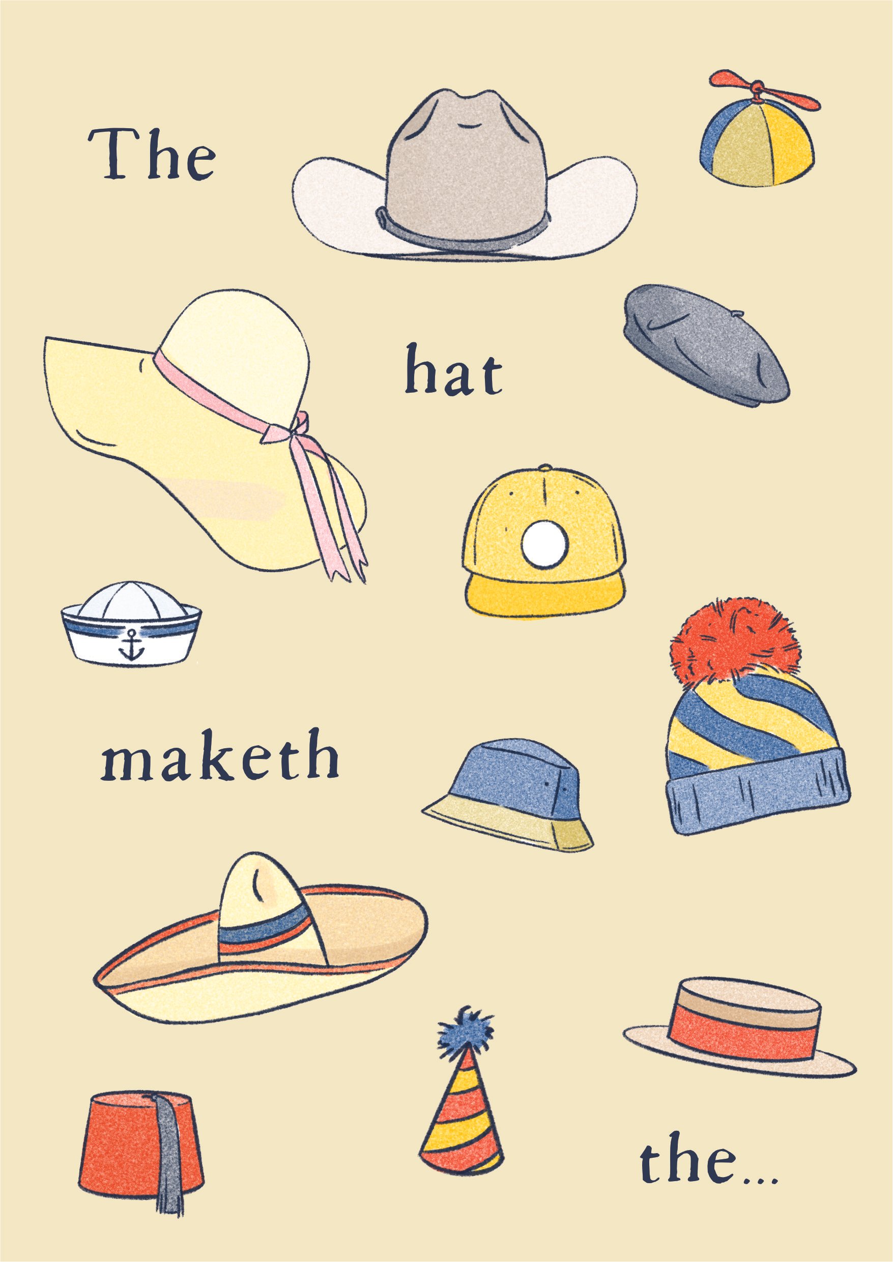
Put a hat on it
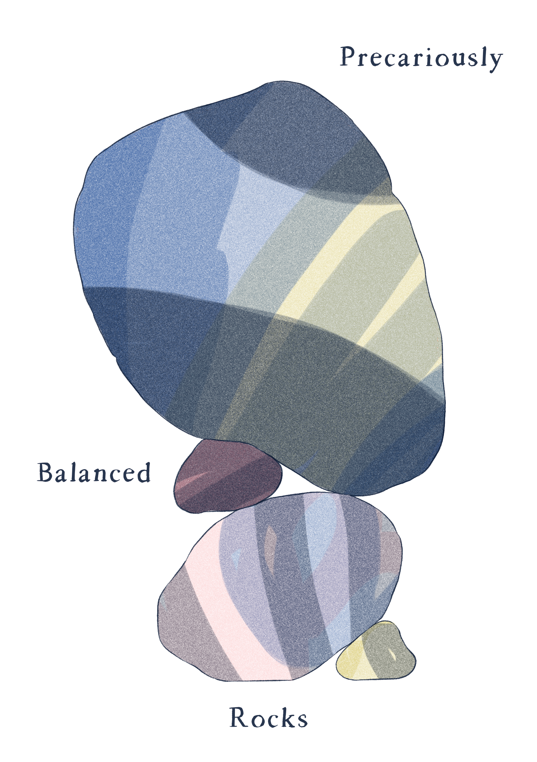
Precariously balanced rocks
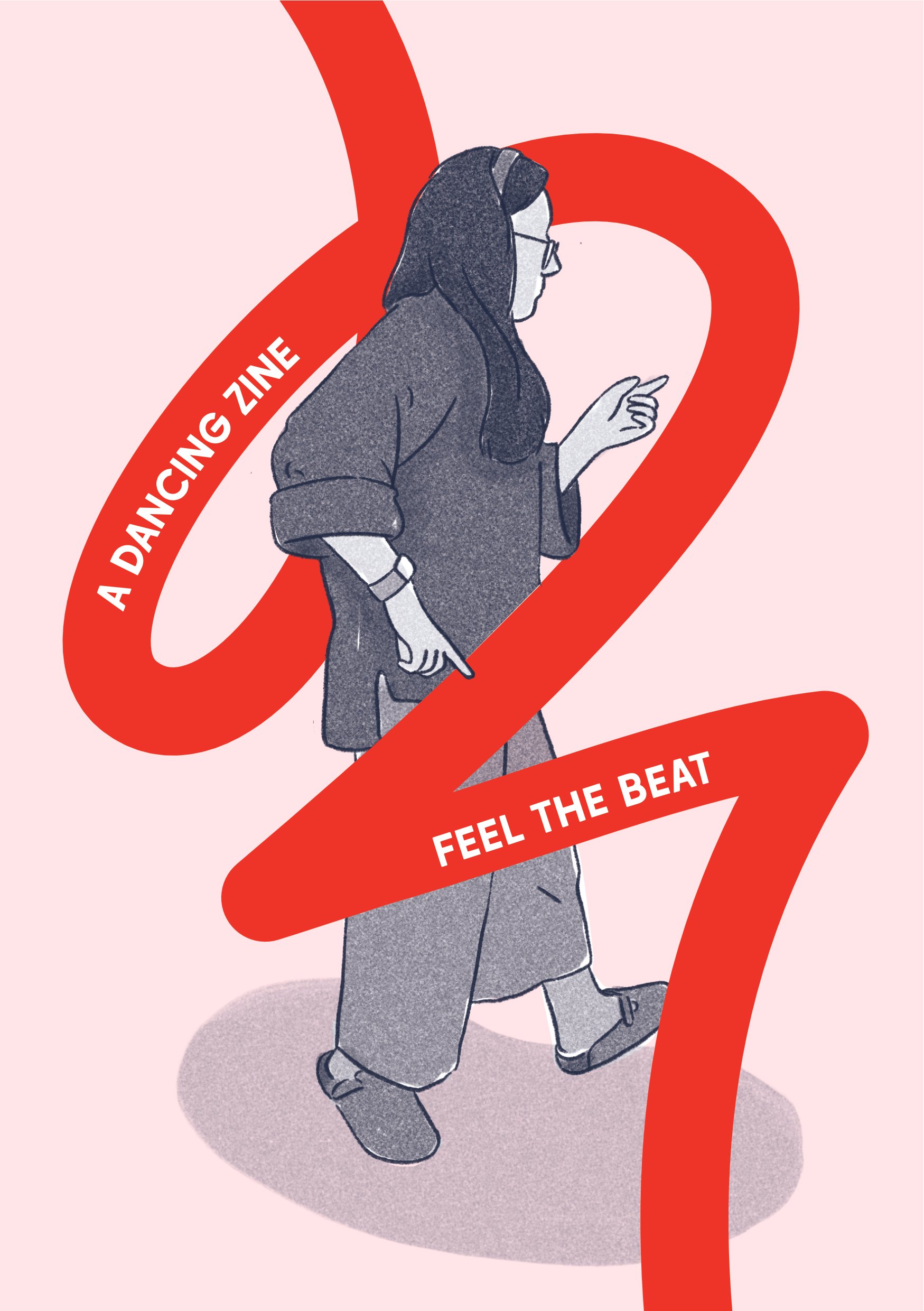
Dance break
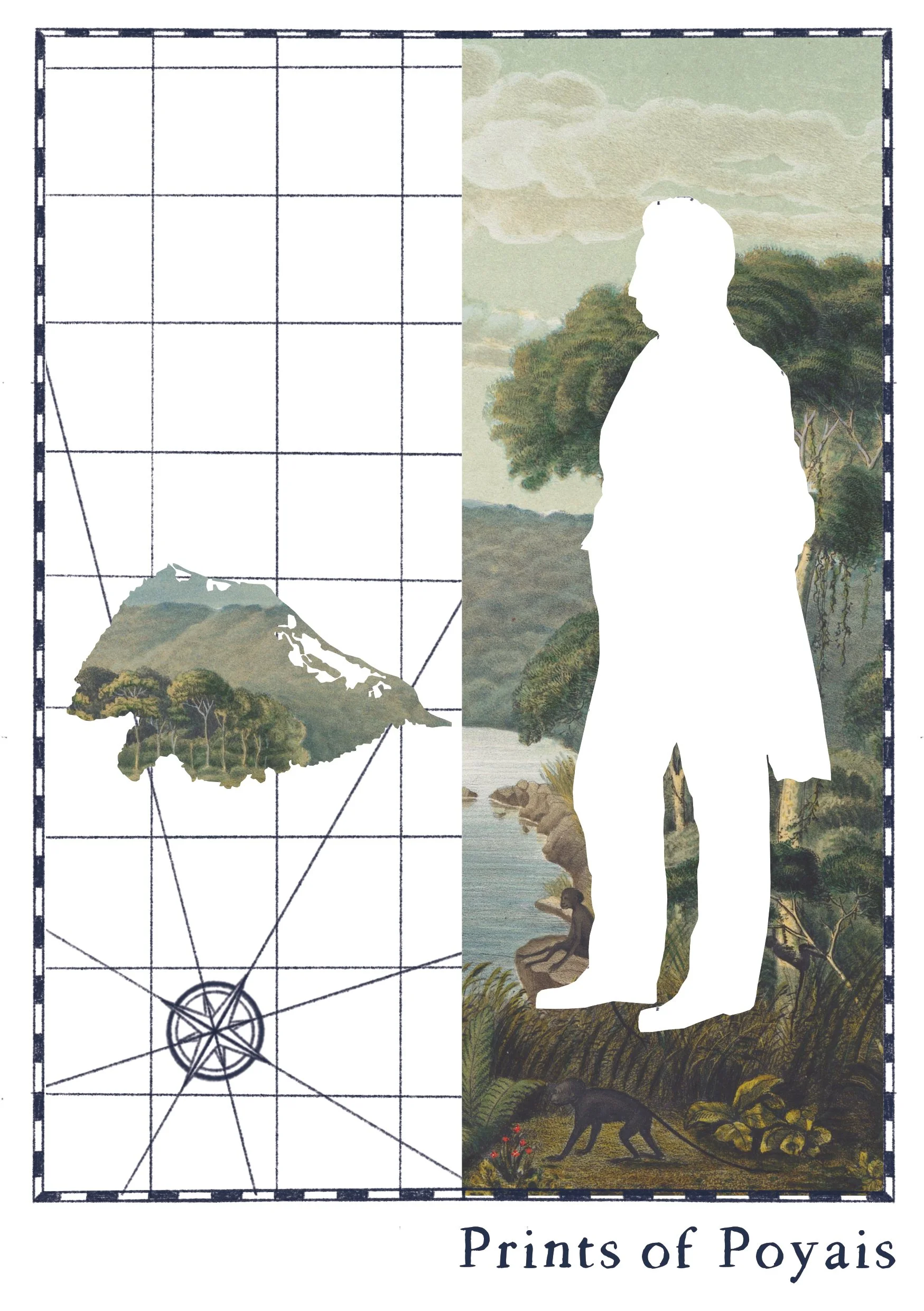
Prints of Poyais

Puzzle mind
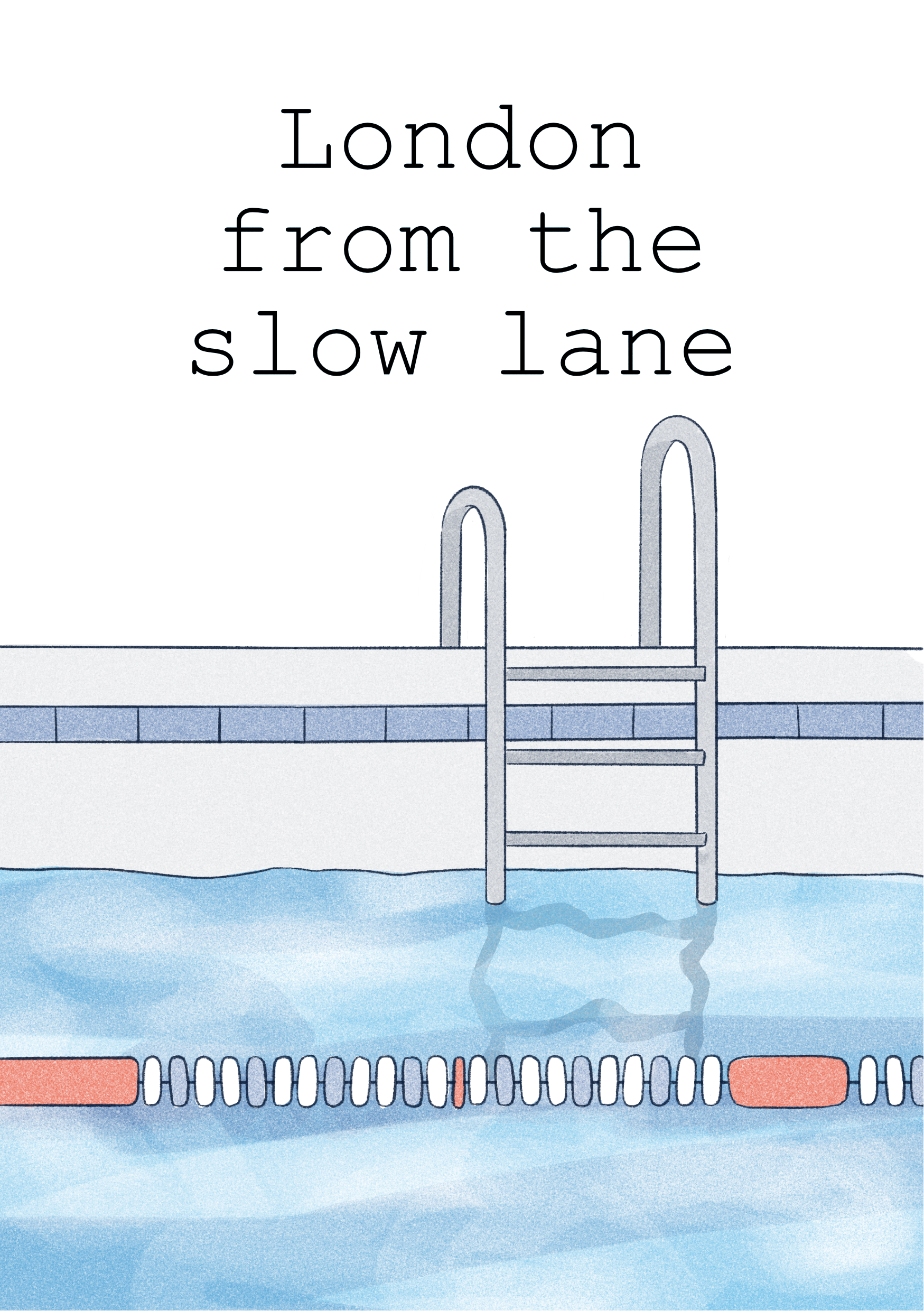
London from the slow lane

Autumn glow

What is a service designer?
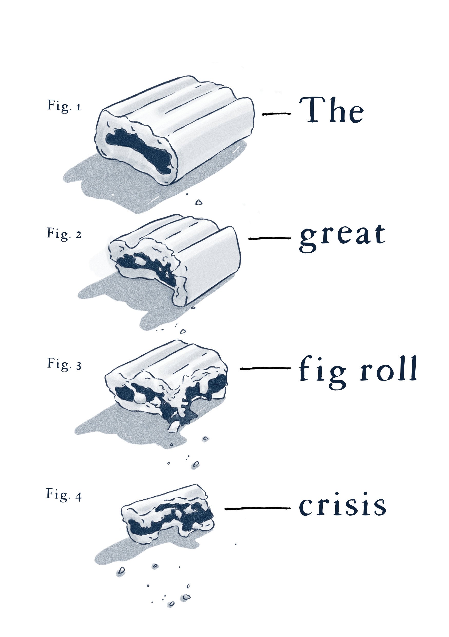
The Great Fig Roll Crisis
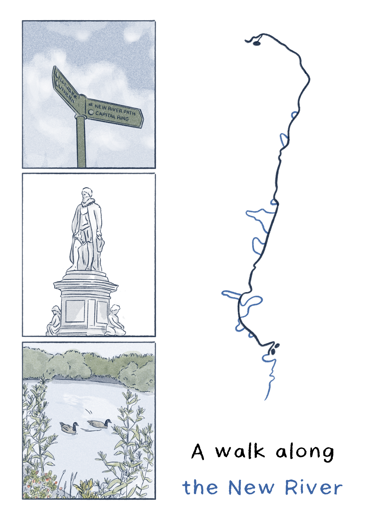
Let's go for a walk
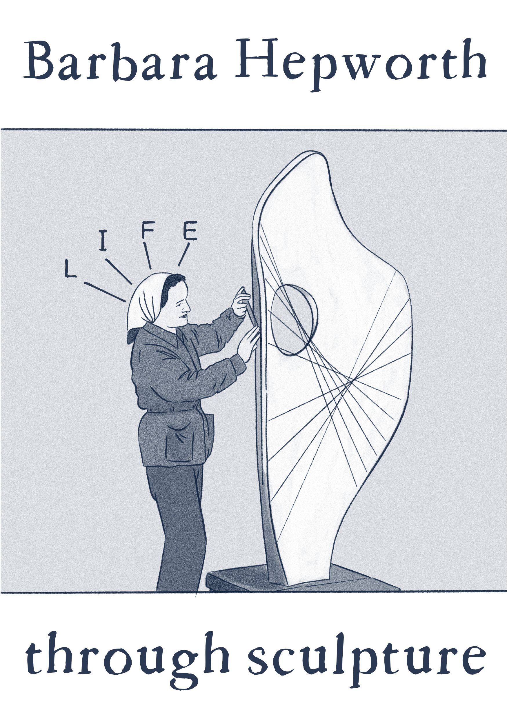
Barbara Hepworth through sculpture

Why Formula 1 is my current creative fuel
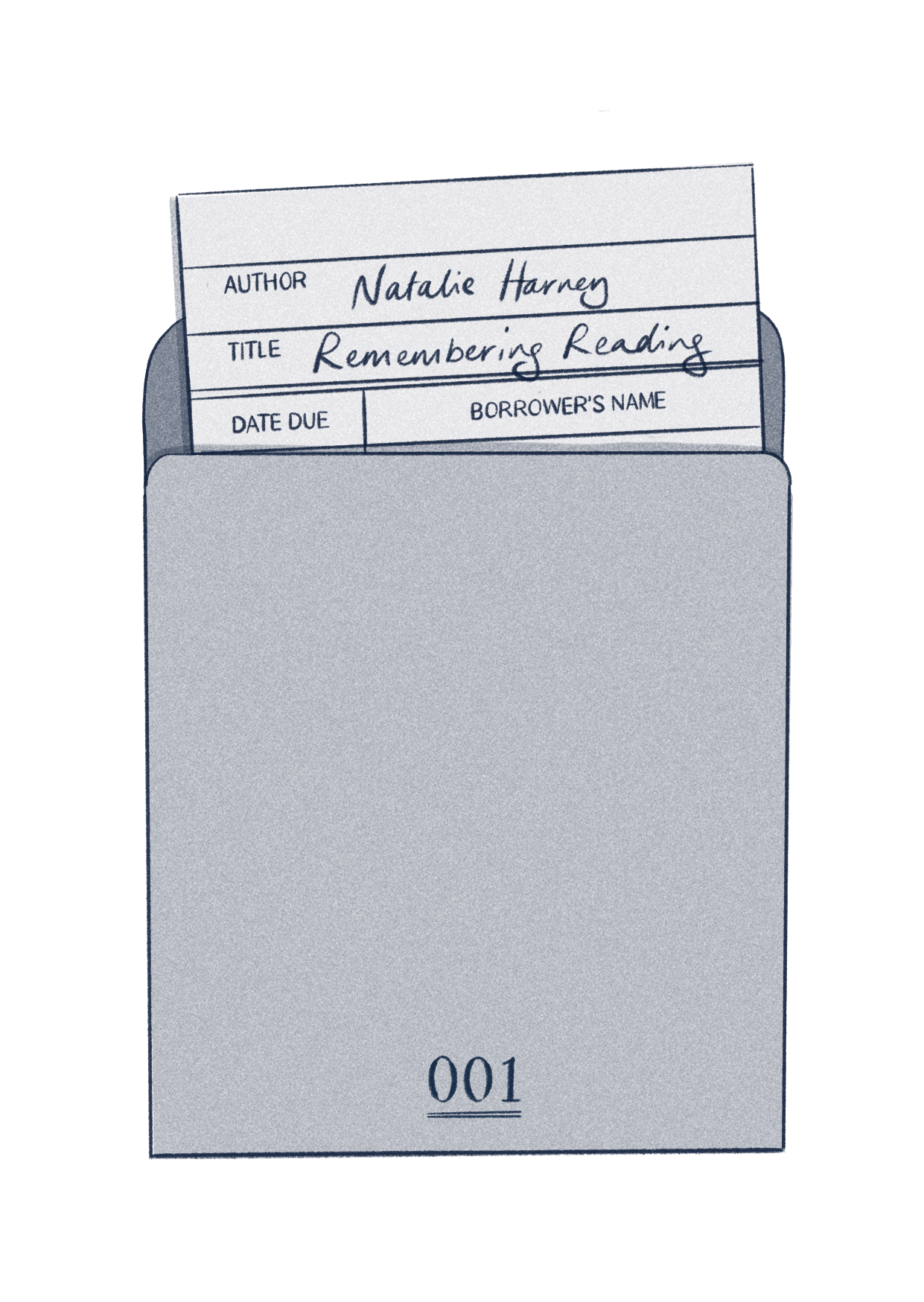
A reading story
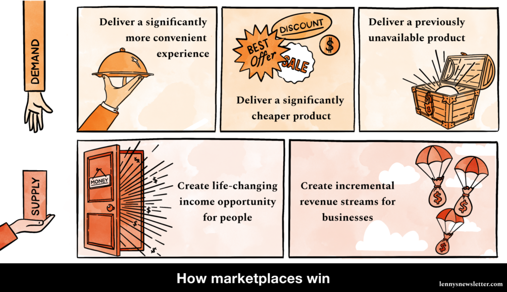
Making infographics for one of Substack's biggest newsletters
A lot of the client illustration work I’ve done this year has been for Lenny’s newsletter, which is “a weekly advice column about product, growth, working with humans, and anything else that stresses you out at the office” with over 65,000 subscribers by Lenny Rachitsky. It’s been a lot of fun to work on.
How I make illustration part of my research practice
Getting to draw as part of my research work always feels like a treat. Using visuals to tell a story, gather insights and share information is my happy place.
But it’s easy to forget to bring illustration into my research practice when the common standard is to focus facilitation and documentation around written work. So, I’ve put together a non-exhaustive list of ways that research can be visual.
A decade of lessons illustrated
I’ve enjoyed seeing all of the 2009/2019 side by sides people have been posting on Twitter as a way to welcome in the new year, and the new decade. But, I’m pretty camera shy. So instead, I wanted to try to flex by visual storytelling muscles and try to do my own illustrated versions of a side by side and some of the things I’ve learned in the in between.